


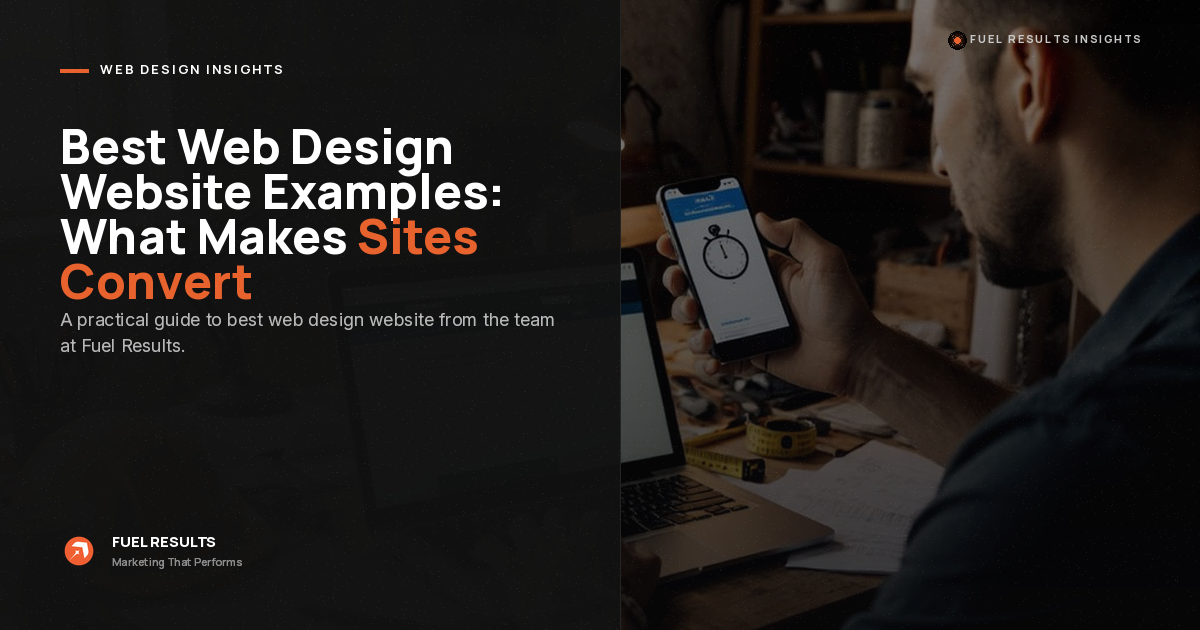


Best Website Design Examples: What Makes High-Converting Sites Work
- The best-looking website and the best-converting website are not always the same thing.
- The best website design examples make the offer clear within seconds.
- Fast load speed, mobile usability, trust signals, and simple CTAs matter more than decoration.
- A redesign that only changes the visuals often fails because it does not fix the conversion structure.
- Service-business websites should be judged by leads, booked appointments, and revenue, not screenshots.
Search for the best website design examples and you will see plenty of beautiful sites with cinematic animations, experimental layouts, and award-worthy visuals, but admiration is not the same as revenue; for service businesses, the best website design makes a stranger understand the offer, trust the company, and take action quickly, which is why copying a flashy portfolio site can be a bad move for a local business that needs calls, quotes, consultations, and booked jobs.
At Fuel Results, we build websites for service businesses, so we judge design differently. We care about whether the page turns traffic into leads. The visuals matter, but only if they support clarity, speed, proof, and conversion. Below are the traits the best website design examples usually share when the goal is not just looking good, but actually getting customers.
What the Best Website Design Examples Have in Common
When people ask for the best website design to copy, they usually point to visuals first: bold colors, smooth animations, video backgrounds, oversized typography, or a clever scroll effect.
Those things are not automatically bad. The problem is that none of them matter if the visitor still cannot answer three basic questions:
What do you do?Can I trust you?
What should I do next?
The best website design examples answer those questions fast. They do not make visitors solve a puzzle. They remove friction. Below are what the best website design examples have in common:
1. You Understand the Offer in Three Seconds
Open the homepage and start a mental stopwatch. Within three seconds, a first-time visitor should know what the company does, who it helps, and what action to take next.
That sounds basic, but this is where a lot of sites fall apart. They lead with vague phrases like “building better solutions” or “reimagining possibilities.” That copy might sound polished in a brand meeting, but on a real website, it is dead weight.
A strong homepage headline says the thing plainly. A roofing company should not hide behind “protecting what matters most.” A law firm should not bury its practice area below a lifestyle image. A contractor should not make the visitor scroll just to find out what city they serve.
The best website design uses design to support clarity, not to camouflage the lack of it.
2. It Loads Fast Enough to Keep People Around
Speed is part of design, even if it does not show up in a screenshot. Google recommends a Largest Contentful Paint of 2.5 seconds or less, which means the main content needs to load fast, especially on mobile. This is where many “beautiful” websites fall apart because huge videos, oversized images, bloated scripts, and unnecessary animations can look premium in a design review but feel painful on a phone.
For service businesses, that delay costs money. If someone is searching for an emergency repair, a consultation, a quote, or a nearby provider, they are not patiently waiting for your homepage animation to finish. They are backing out and clicking the next result.
3. There Is One Obvious Action
The best website design examples do not give visitors ten competing options above the fold. They choose one primary action and repeat it consistently:
- Book a consultation.
- Get a quote.
- Call now.
- Schedule an inspection.
- Start your free audit.
Every extra choice creates friction, so a header with five equal-weight buttons is not helpful, it is indecisive. Visitors should never have to wonder what the next step is. For service businesses, the CTA should match the buying process, whether that means “Book a strategy call,” “Request a consultation,” “Call now,” or “Get a quote.”
The CTA is not just a button. It is the path to revenue.
4. The Best Website Design Is Built for the Phone First
Most service-business owners still review their website on a desktop monitor, but their customers often do not. Mobile visitors move faster, use smaller screens, and usually navigate with one thumb, so the design has to work under real-world pressure. Text should be readable without zooming, buttons should be easy to tap, phone numbers should be obvious, and forms should not feel like paperwork.
One thing we see constantly with service-business websites is this: the desktop version looks acceptable, but the mobile version exposes the real problem. The hero image takes over the screen. The CTA disappears. The menu is clunky. The form feels endless. The phone number is buried.
The best website design starts with the mobile decision path, then expands to desktop. Not the other way around.
5. It Proves the Claim
Nobody believes “we are the best.” They believe the evidence.
Sites that convert well do not just make claims; they back them up with reviews, testimonials, project photos, certifications, recognizable client logos, before-and-after results, case studies, and specific numbers. A weak proof section says, “We deliver excellent service,” while a stronger one shows a real customer explaining what changed after working with the company. Proof should not be buried on a testimonials page nobody visits; it should appear near the moments where visitors are deciding whether to click, call, or fill out a form.
For Fuel Results, this is one reason our web design services are built around lead generation instead of just layout. A good site needs to look credible, but it also needs to place proof where it can actually influence the decision.

6. The Form Does Not Fight the Visitor
A contact form with eleven required fields is not a form. It is a wall. The best website design examples ask for enough information to start the conversation, not enough information to fully qualify, diagnose, and close the deal before anyone has spoken to the prospect.
Usually, that means:
- Name.
- Phone or email.
- A short message or project detail.
That is enough for most first-touch inquiries. You can gather the rest during follow-up. This is especially important for service businesses because many prospects are not casually browsing. They may be comparing providers, solving an urgent problem, or trying to make a decision quickly. If the form feels like work, you lose them.
Do not remove fields blindly, though. That advice gets repeated too often and becomes dumb. The goal is not the shortest form possible. The goal is the lowest-friction form that still gives your team enough information to respond properly.
7. The Copy Is Built for Scanning
Visitors do not read a website like a book. They scan.
That means the layout has to make the argument easy to understand at a glance. Short paragraphs. Clear subheadings. Specific bullets. Strong section labels. No massive text blocks.
This is where a lot of “best website design” roundups miss the point. They judge the look of the page but ignore whether the words are doing any selling. Good design makes the copy easier to absorb. Bad design makes even good copy feel like homework.
For service businesses, every section should help the visitor move closer to a decision. If a paragraph does not clarify the offer, answer an objection, prove credibility, or push the next action, it probably does not belong.
Beautiful vs. Effective: The Distinction That Costs Owners the Most
Here is the trap: a website can look impressive, earn compliments, and still fail if it does not produce leads.
| Beautiful Website Thinking | Conversion-Focused Website Thinking |
|---|---|
| “This site looks stunning, so it must be effective.” | “This site is effective only if it turns visitors into inquiries, calls, quotes, consultations, or booked jobs.” |
| Prioritizes originality, craft, animations, and visual polish. | Prioritizes clarity, speed, trust, CTAs, and a clean path to contact the business. |
| May win design praise but leave the phone quiet. | May look simpler than expected but gives visitors a clear reason to act. |
| Treats the website like a digital art project. | Treats the website like part of the sales system. |
| Measures success by how impressive the site looks. | Measures success by leads, booked appointments, and cost per acquisition. |
| Can increase traffic without increasing revenue. | Connects attention to action through structure, proof, and frictionless conversion paths. |
| The look earns attention. | The structure earns the lead. |
That is why the best website design for a service company is not always the flashiest one. It is the one that makes the next step obvious, removes hesitation, and turns visitor attention into real business opportunities.
Magnolia I., 5-star review
How to Apply These Lessons to Your Own Site
You do not need to rebuild everything to start closing the gap with the best examples. Run your own site through the same checks you would use to judge anyone else’s, and fix the cheapest, highest-impact problems first.
Run the three-second test. Ask someone unfamiliar to look at your homepage for three seconds, then close it. Can they tell you what you do and who you do it for? If not, rewrite the headline before touching anything else.
Check your speed on a phone. Run your mobile homepage through a free tool like Google PageSpeed Insights. Anything slower than roughly three seconds to load is costing you visitors right now.
Count your calls-to-action. If the header offers more than one or two paths, cut down to a single primary action and repeat it consistently down the page.
Trim your forms. Remove every field you do not truly need to start a conversation. Watch completions rise.
Add proof where decisions happen. Put reviews, results, and recognizable logos next to your buttons, not buried on an “About” page.
Design and lead generation are not separate projects. A site is only finished when the layout, the copy, and the follow-up work together, which is why we pair web design with conversion-focused marketing funnels so a new lead is captured, routed, and followed up with the moment it arrives. The prettiest page in the world is wasted if the inquiry it generates lands in an inbox nobody checks.
If you want to see how these principles look in practice, browse our breakdown of the best websites for web design inspiration in 2026, then read up on the most common website conversion mistakes so you can avoid the ones quietly draining your traffic.
The Bottom Line
The best website design examples are not always the loudest, flashiest, or most experimental websites online.
They are the ones that make a stranger understand the offer quickly, trust the business through proof, and take the next step without friction. They work on mobile. They load fast. They use one clear CTA. They make the copy easy to scan. They are designed around the customer’s decision, not the designer’s ego.
That is the standard worth copying.
If your website looks good but does not bring in leads, the problem is probably not that you need more animation, more pages, or a trendier layout. The problem is usually simpler and more painful: the site is not clear enough, fast enough, trustworthy enough, or direct enough to convert.
Fix that first. Then make it beautiful.


